Can You Feel the Love?
Somewhat unexpectedly, Candygrams is back.
The first half of 2026 was busy. In essence, from about the start of December through Valentine’s Day, most of my attention was on launching McNugget Caviar at work.
Which meant that even though I wanted to do a little content update for Candygrams—my Valentine sticker maker. It wasn’t in the cards. At work, McNugget Caviar launched just ahead of Valentine’s Day, and to really capitalize on the moment, an app update would have needed to be out shortly before mid-January.
And at this point, in addition to a Liquid Glass overhaul, where I left my dev build of Candygrams had a lot of CloudKit cruft from less-informed decisions I’d made when I first released it in February of 2017.
I was starting to ask if Candygrams was something I still wanted to have on the App Store. And then a few days after Deep Dish Swift I was taking a walk when I got the notification from App Store Connect: This app has gone too long without an update.
Faced with that “This goes away in 90 days,” updating it was the right choice and taught me a few things.
Lesson 1: Navigation and Hierarchy
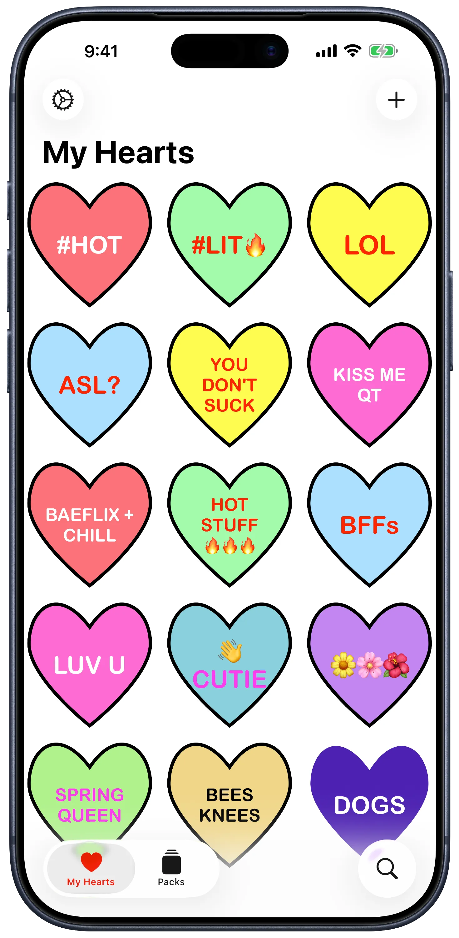
The last major Candygrams update was a SwiftUI rewrite in 2022 that was written against iOS 15. Three tabs: the gallery, a packs collection, a settings screen.
-
Closing up tabs. Coming off some design work on PolitiCall last fall, I wanted to make Candygrams feel like an iOS 26-era app. That tab bar was the first thing that needed some clarity. So settings got promoted to a leading toolbar.
-
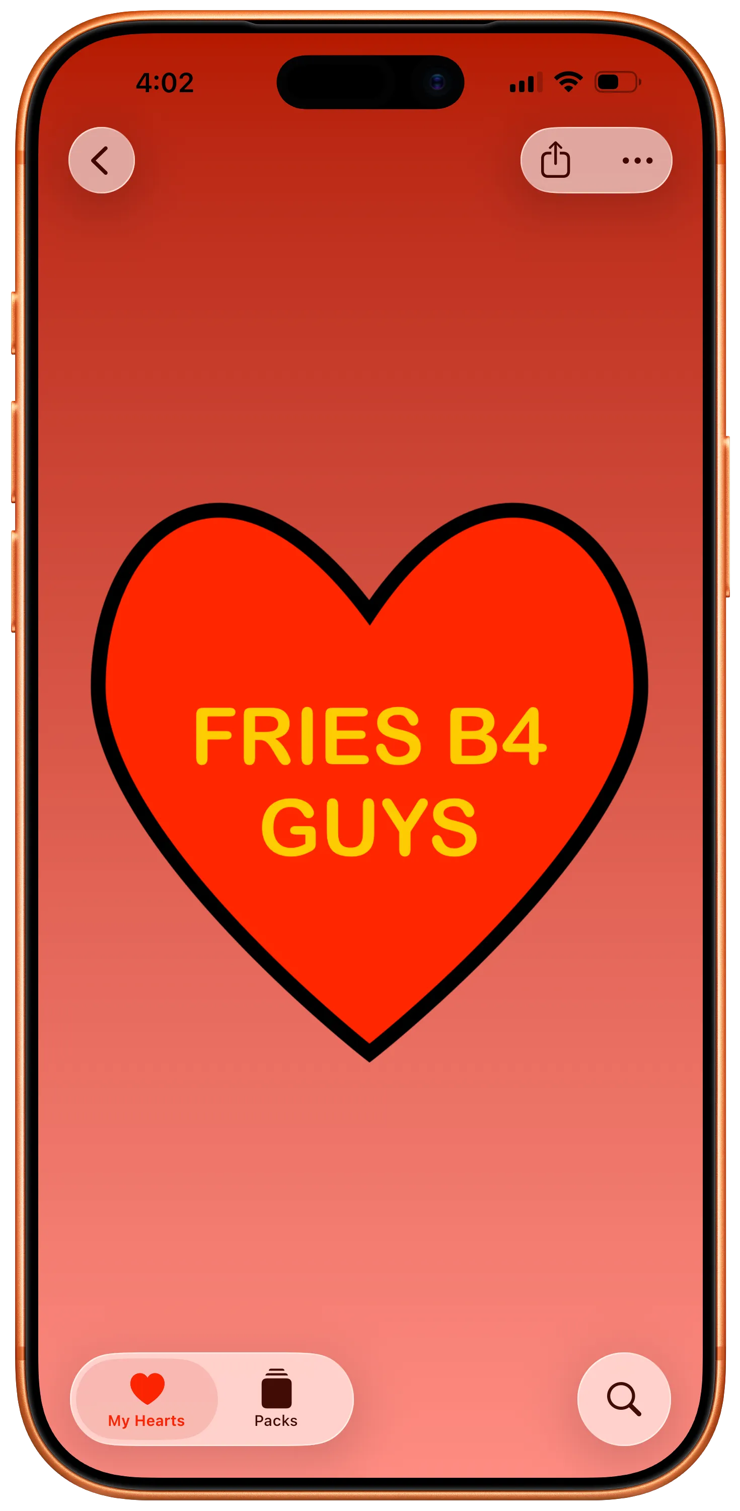
Scaring ourselves sheet-less. Full-screen sheets like composers cover content, and in an app like Candygrams where most of the content being detailed is the sticker, it didn’t quite feel right to have that form-based composer flow that’s been a staple for most of the app’s life. Instead of presenting a form, the app now creates a new Candygram when the compose button is pressed, then does a zoom transition into the detail screen, primed to edit with a floating panel of segmented controls. That elminiates a long-scrolling sectioned form and instead keeps what’s in your heart visible while editing.
-
Less prescriptive sharing. The legacy build of Candygrams included a dedicated UIActivity for sharing to Instagram Stories. I’ve migrated this to a SwiftUI ShareLink for sharing photos, maintaining a separate option from the share menu for Instagram Stories. I’m still a little conflicted on this choice, but I think its the right one based on decisions I’ve made around Candygram backgrounds. Speaking of…
Lesson 2: Building for Maximum Delight
As a rule, I don’t do minimum viable product. My version of an MVP is the Minimally Delightful Product. If it doesn’t have whimsy, if it doesn’t sprinkle in a little bit of joy, why would I keep using it? Why would I keep building it? Candygrams got some additional delight in this build by loosening some barriers to creativity.
-
Background gradients. The Candygram detail screen has always been a little weird. If I tried to scale the heart to fill the frame, you get an OK look on an iPhone, and then my 13” iPad Pro winds up getting a blurry heart that looks like it’s screaming at me. Early on in this version, the Instagram Story share experience started by choosing colors for the background of a Story frame. The story share API basically has you pass these as colors. As I got going, though, adding them to the Candygram itself felt more aligned to the content-focus pillar of the design principles for Liquid Glass.
-
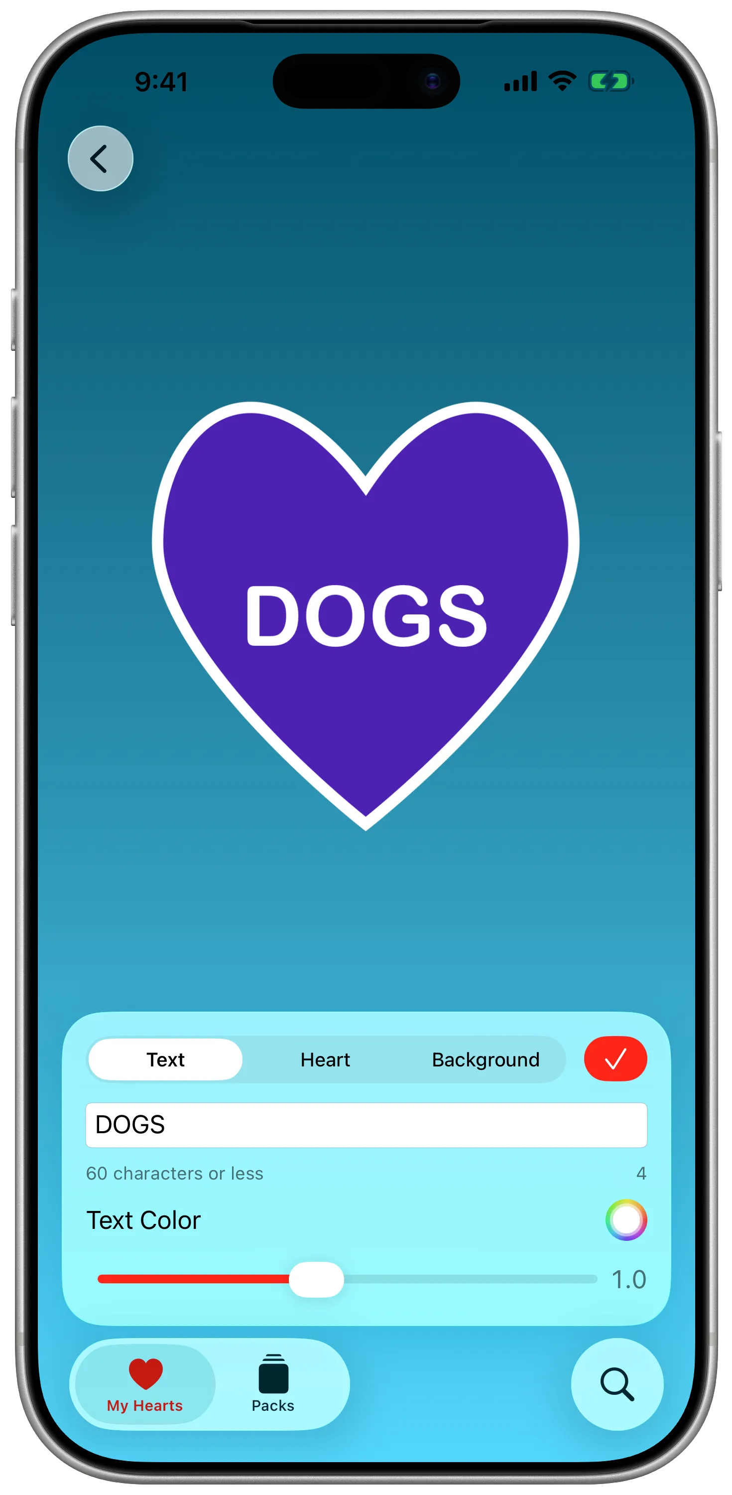
Font scaling. Before I was a creative technologist in an agency, I was a copywriter. Shortening something to under 60 characters is an art. But so is balancing typography and font scales so that it can fit. In earlier versions, the app would attempt to manually resize text to fit based on character length. In this version, font scale is a slider to try and finesse the fine-grain tweaks to get one dangling character onto a line without sacrificing the look. Or needing a font size panel. This also allows for more unhinged creations, like quotes. …it’s probably not what you want, but I’m not going to tell you you can’t.
Lesson 3: Accessible and Customizable
I care a lot about accessibility, frequently to the chagrin of my colleagues in the agency when I remind them that social posts that are images of text with no alt text are trash no matter how well it did, and that no they cannot have a flashing marquee on their brand site.
Candygrams really didn’t practice what I preach, though. And that’s largely because the last update was a different moment in my values, in my skillset, in my understanding. There’s more work to do here, but I’m proud to say it’s not got Accessibility Nutrition Labels.
-
VoiceOver. I don’t know that I’ve done the implementation perfectly yet (if you have feedback, please reach out!), but I’ve tried to be thoughful where custom input and previews are involved here. Candygrams has had support for descriptions of stickers sent and received in iMessage since the early days, but the composer and in-app activties should be much more descriptive and targeted now.
-
Adaptive transparency and reduce motion. Just like with PolitiCall’s iOS 26 redesign, those zoom transitions are turned off if we’re in a context asking for reduced motion. Unlike PolitiCall, I went a step further and tried to dynamically swap out our materials on glass panels when requested, too.
What’s next?
Shipping an update to Candygrams gives me a clearer conscience and mental workspace going into WWDC.
But there are still a couple features I really want in Candygrams that still aren’t there. Before we get too far into the summer, I might try and eek out one or two of those.